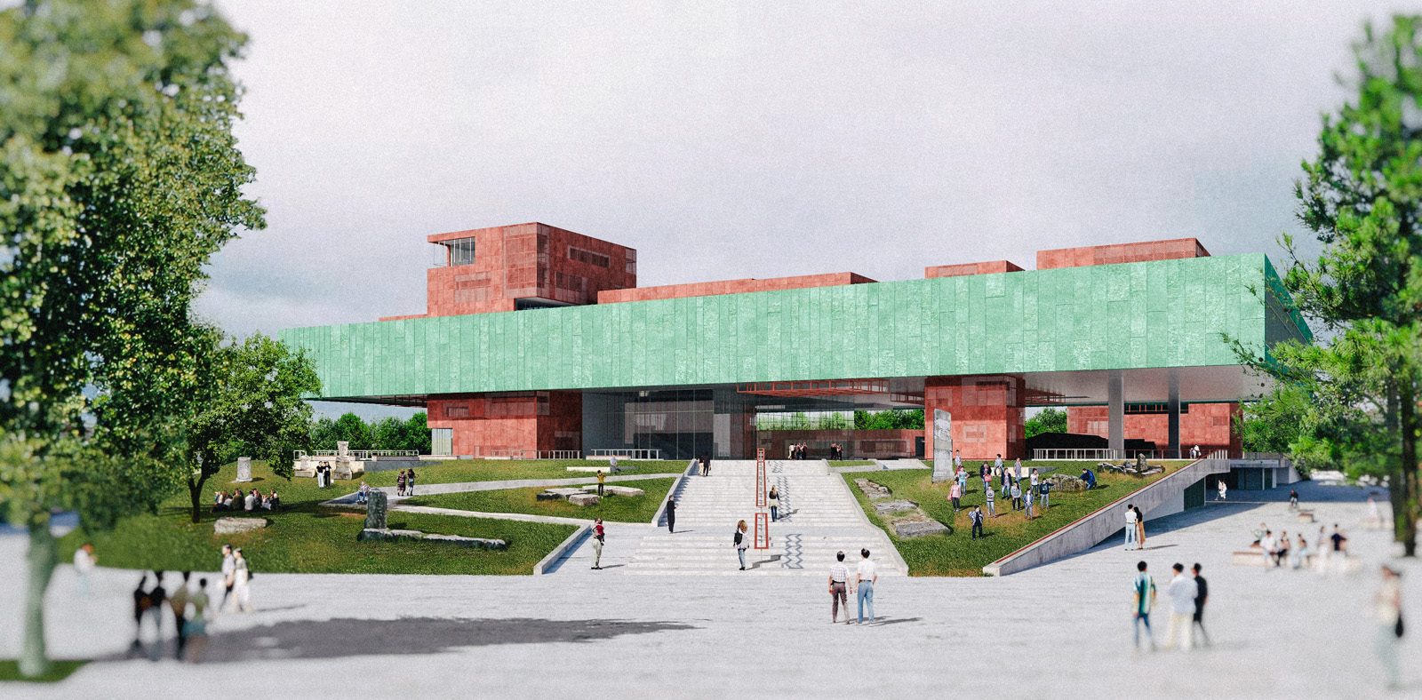
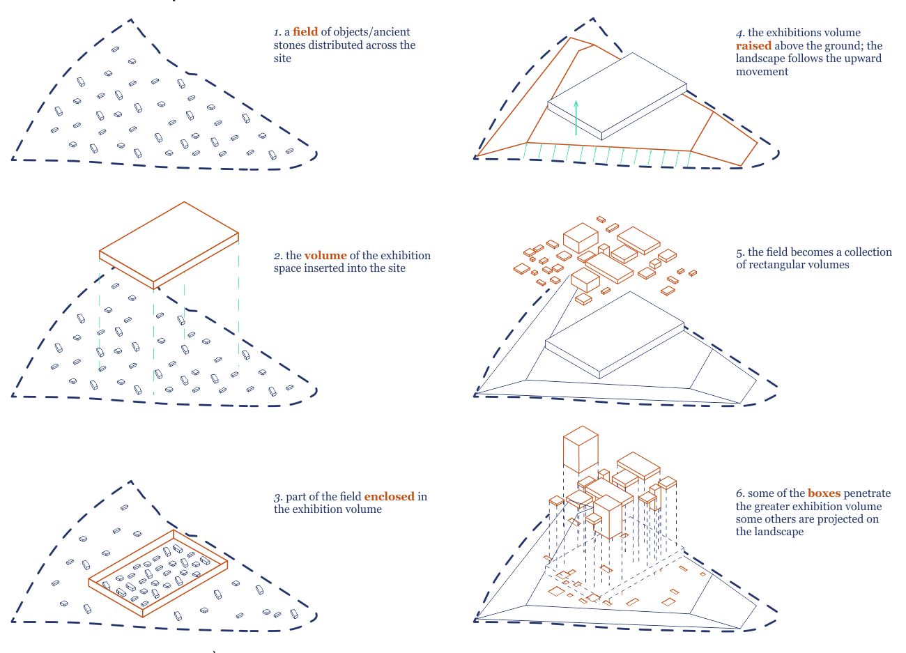
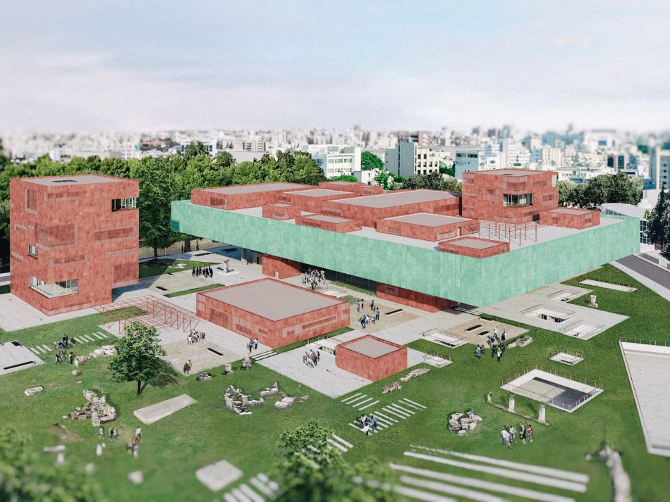
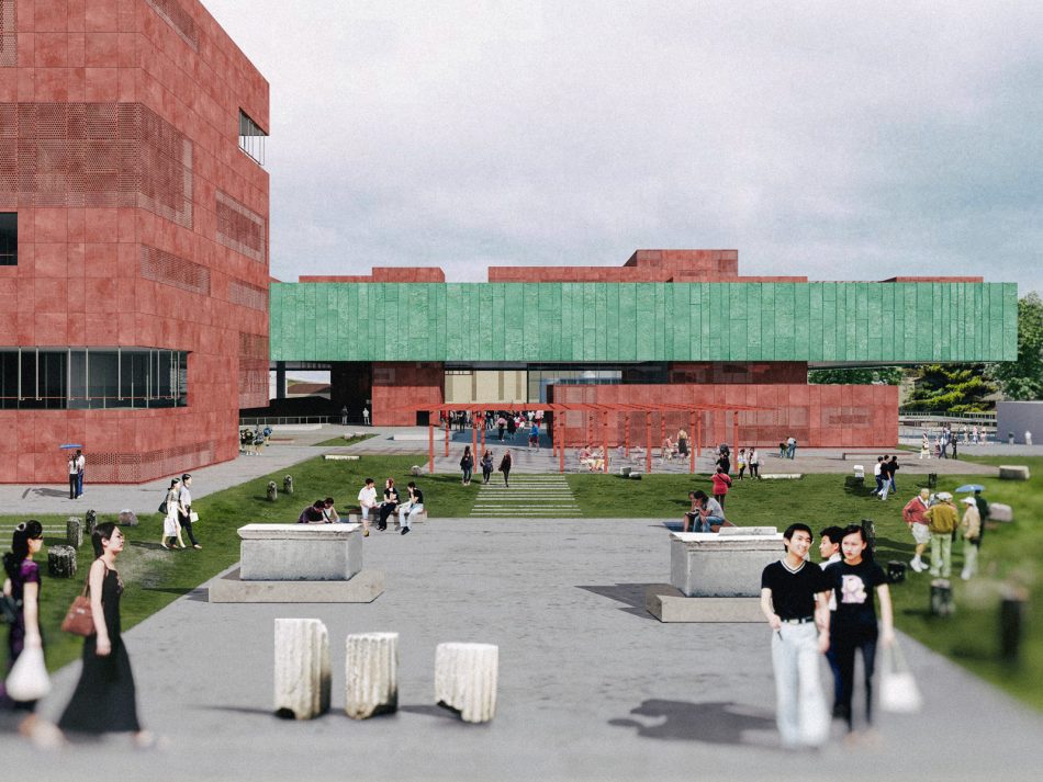
The design proposal for the New Cyprus Museum Competition started from the idea that the visitors should be able to experience ancient Cypriot culture both on the inside of the museum, the exhibition spaces, as well as on the outside, the landscape surrounding it. The starting point therefore was that of the whole site occupied by large pieces of ancient stones; a field of ancient fragments shattered around, allowing someone to wonder about them freely.
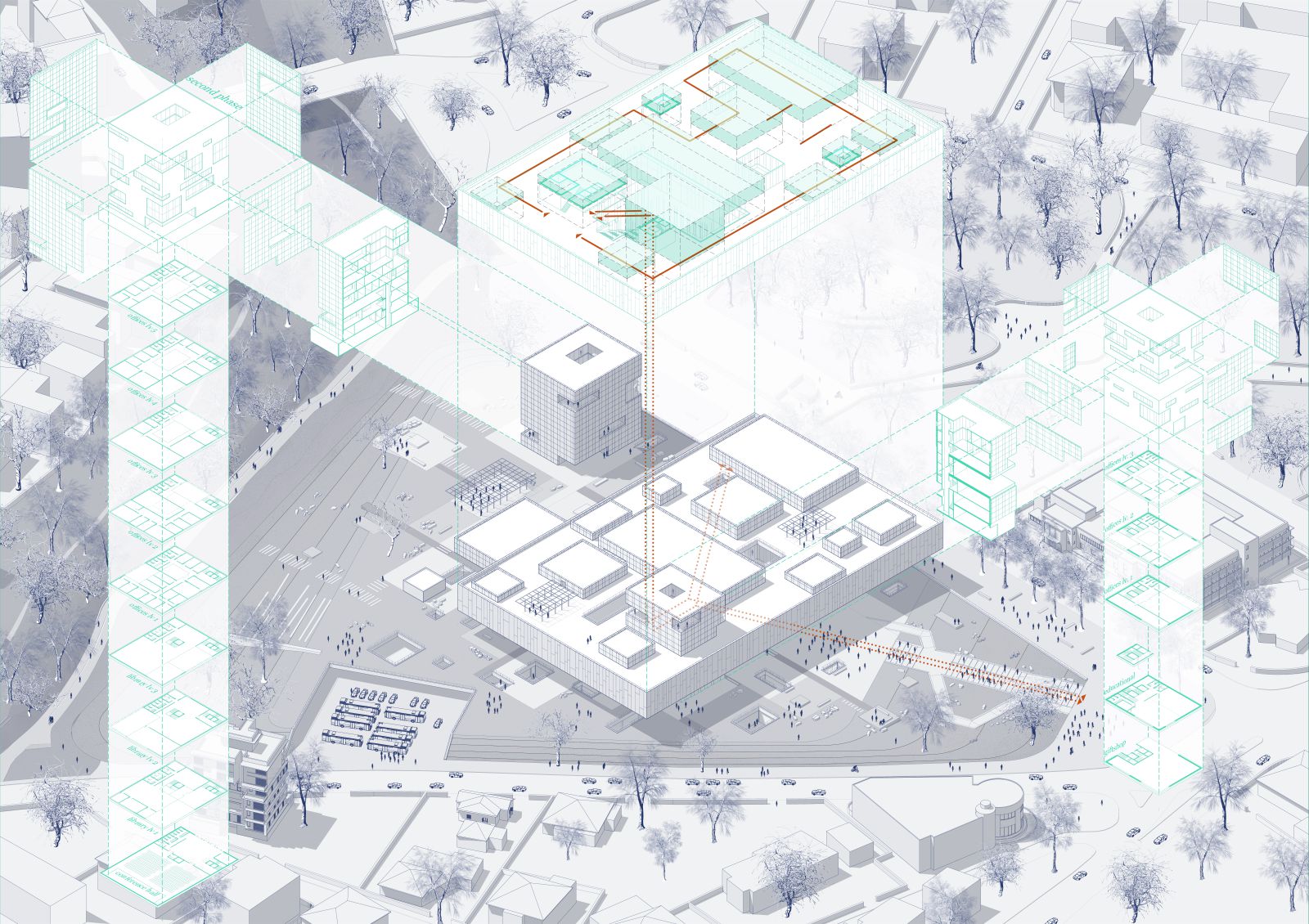
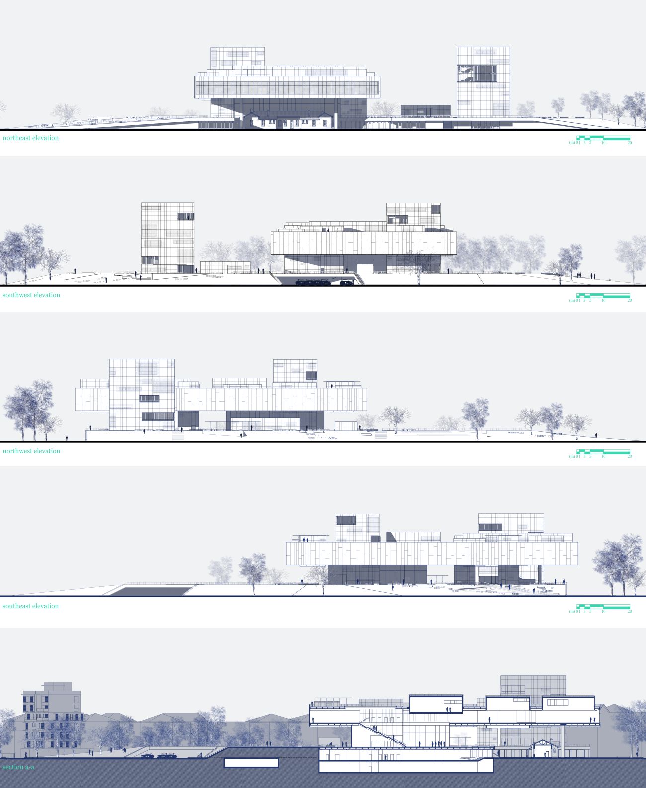
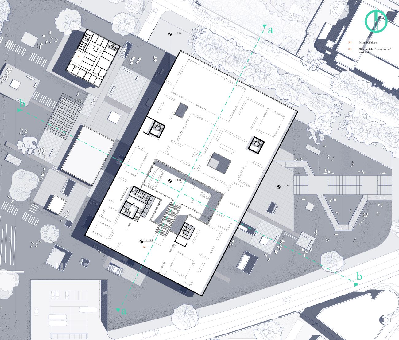
Consequently, a large rectilinear volume, containing the sum of the required exhibition space, was placed centrally in the site and elevated several meters above the ground to allow free movement on the site. The surface of the ground below the exhibition volume followed the upward movement generating this way a gentle slope beginning on the northwest corner of the site, reaching a one-floor height at the center and then slopping slowly again to meet the river at the back, north-east side of the site.
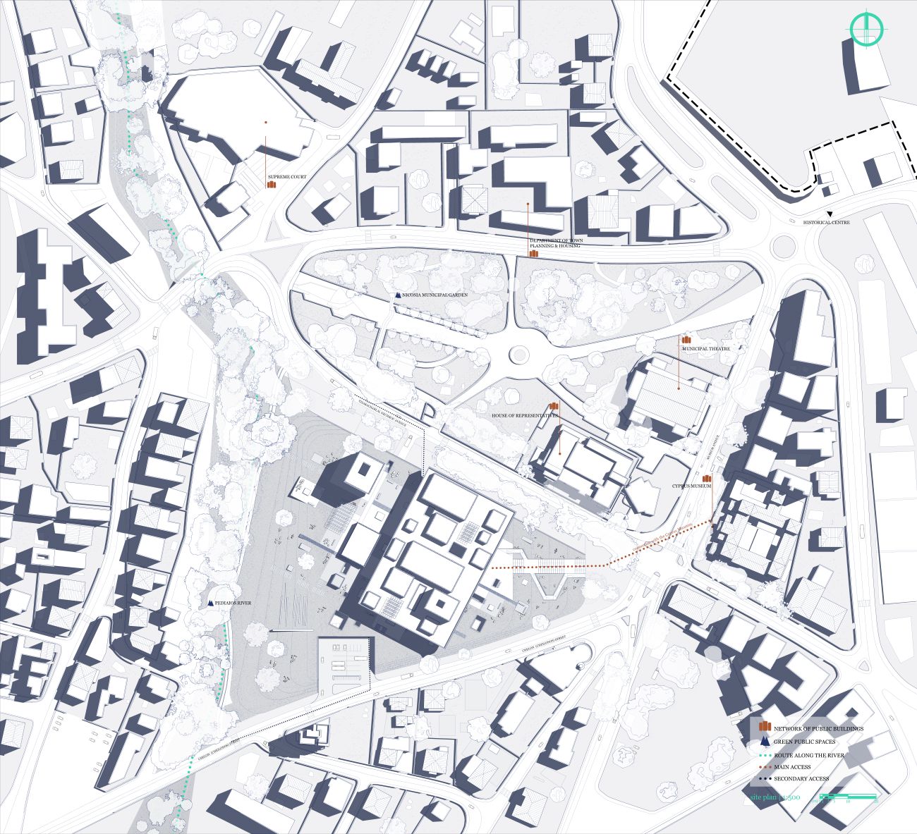
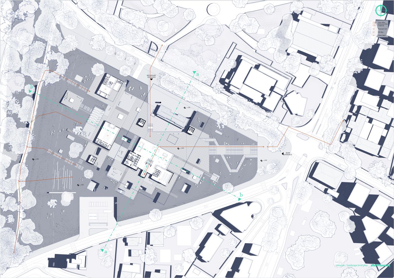
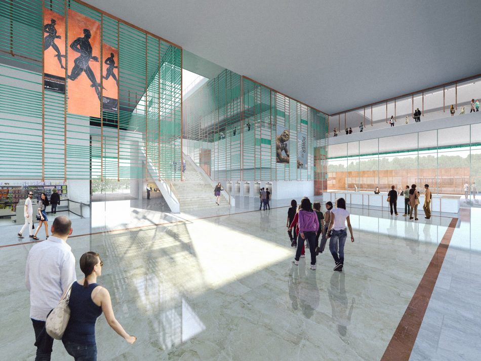
All auxiliary spaces are placed on the original ground level, below the elevated landscape. The main entrance to the site is placed on the northeast corner where a staircase following the elevations leads you to the top of the landscape and to the entrance to the building. A secondary – but accessible to the public – entrance is located on the north side, along T. Nechrou street. All exhibition spaces are located in the elevated volume, in one level.
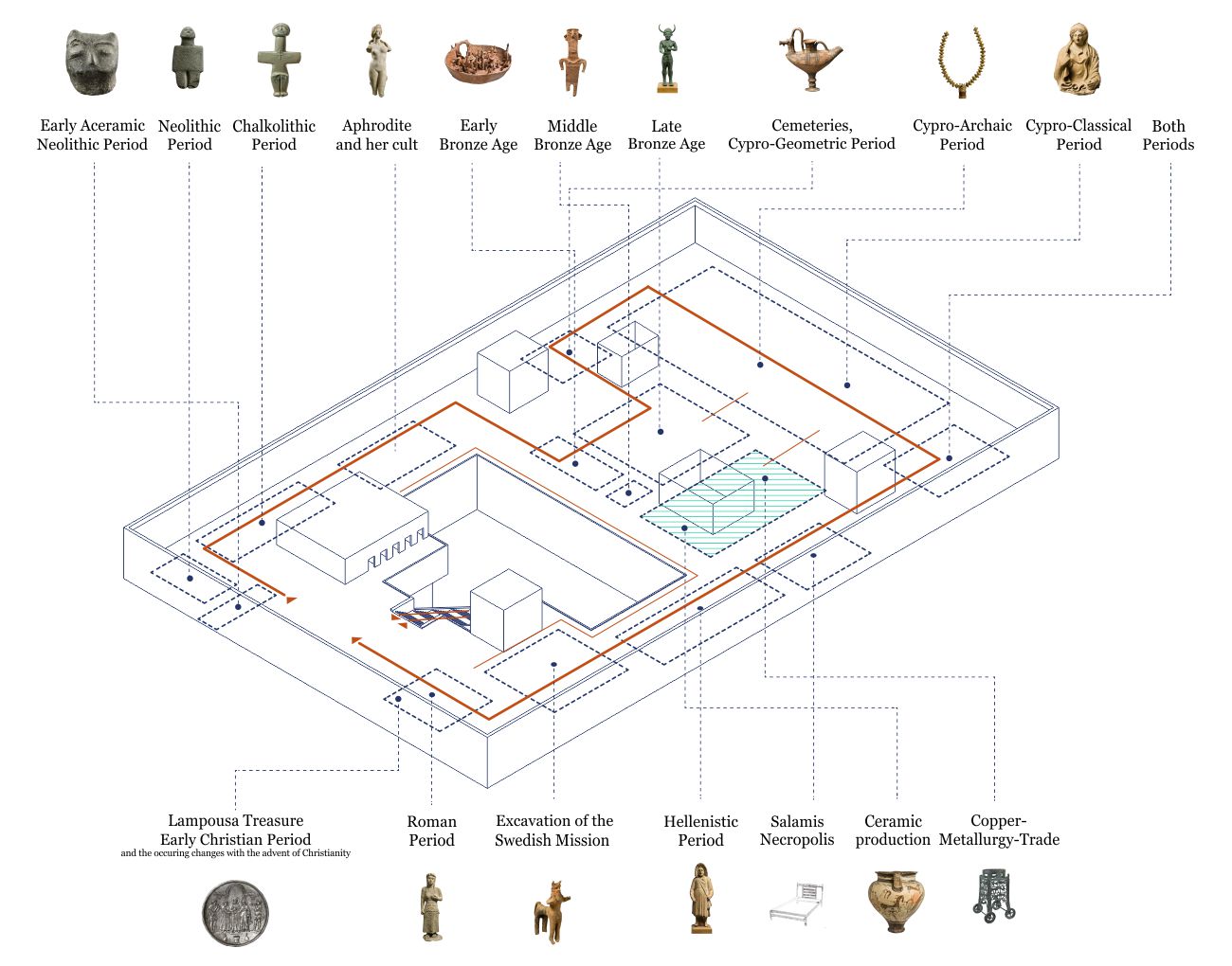
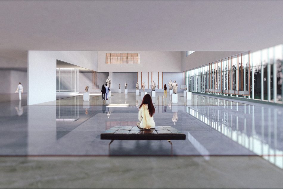
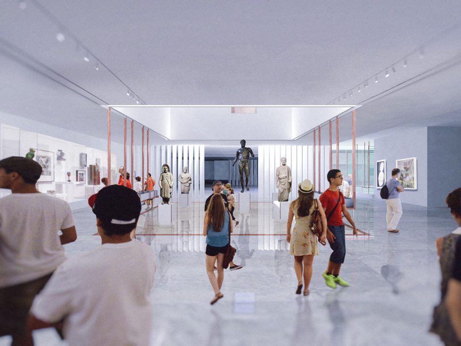
The initial idea of the field was further expanded in order to specify the organizational principles of several elements of the design, the most important being the organization of the exhibition space itself: The main exhibition is structured around a field of rectangles that contain the different eras that will be represented in the exhibition and which penetrate the main volume, creating double height spaces inside them; a kind of ‘exhibition pots’. While the main items of each era are displayed within the volumes defined by the pots, the exhibition continues outside them. The visitors can follow a predefined, clockwise movement sequenced in a chronological manner, or if they choose, they can roam freely in the exhibition space. At the same time, the visitors both when following the chronological order and when they wonder freely in the exhibition, can choose to ender the pots and see the items of their respective era in detail, or they can choose to move on quickly and reach another point of interest in the exhibition. The structure of the exhibition space therefore allows both for a clearly defined and chronologically organized experience as well as for a custom one, created by the visitor.
Resuming the initial idea of the site being occupied by large pieces of ancient stone, a secondary “exhibition” inhabit the landscape the runs along the whole site. Secondary large archaeological findings, that are not important enough to be displayed, are scattered around. That second exhibition does not follow any specific order; it coexist with several spaces intended to be occupied by the visitors and the citizens of Nicosia.
The second phase of the competition program is located in the back, northwest side of the side. The conference hall, the library and the offices are place inside a single tall volume that echoes the volume of the offices of the first phase.
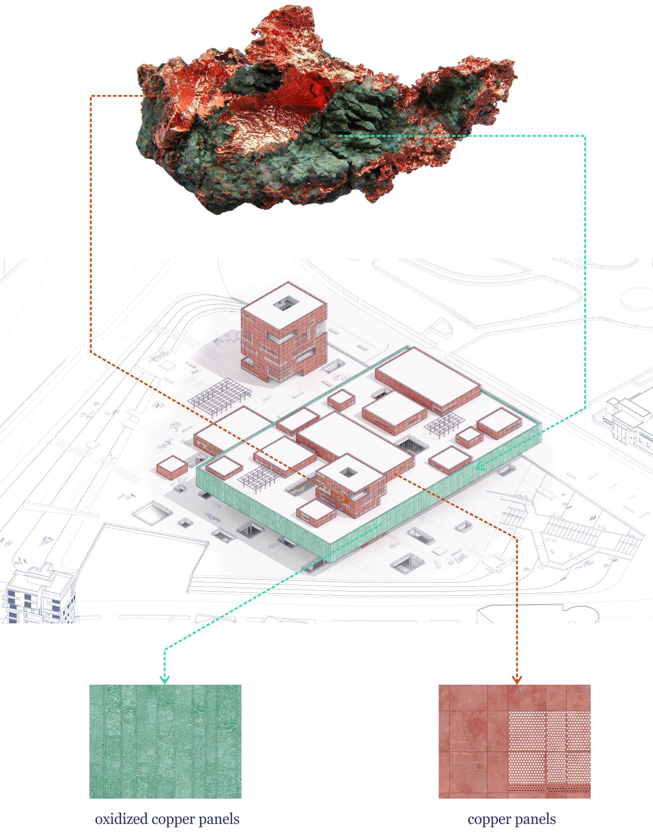
The building and its landscape aims to become a part of the urban tissue of Nicosia: The northern side of the exhibition volume reaches the edge of the site and the thick line of trees occupying it, hovering above the existing historical building of the site, addressing the significance of Nechrou Street. The main entrance of the site is placed right across the old museums, allowing for an easy transition from the new building to the old and vice versa. At the same time the proposed landscape functions as an extension of the linear public space and the routes that follow the Pediaios River. The landscape, being accessible throughout the day and independently from the main function of the museum can become a new public space for the city, located in a very central area. This way the museum can provide a vital space also for the citizens of Nicosia and not only for the visitors. The materiality of the building explores the possibilities of copper, a material that took its name from Cyprus, and at the same time defined art and construction on the island throughout the antiquity. Therefore the large rectangular volume of the exhibition space is cladded in oxidized copper panels, assigning a strong green color that underline the importance of the building. All other volumes are cladded with bronze copper panels, perforated where in front of openings. Both materials can be found in several other details throughout the building.

| >>info: | |
| design: | object-e | Dimitris Gourdoukis & Katerina Tryfonidou with Nefeli Charchari, Anastasia Drougka, Stauros Oikonomidis, Xenia Papastergiou. |
| museology consultant: | Machi Pesmatzoglou |
| date: | 2016 - 2017 |
